 13/12/2021
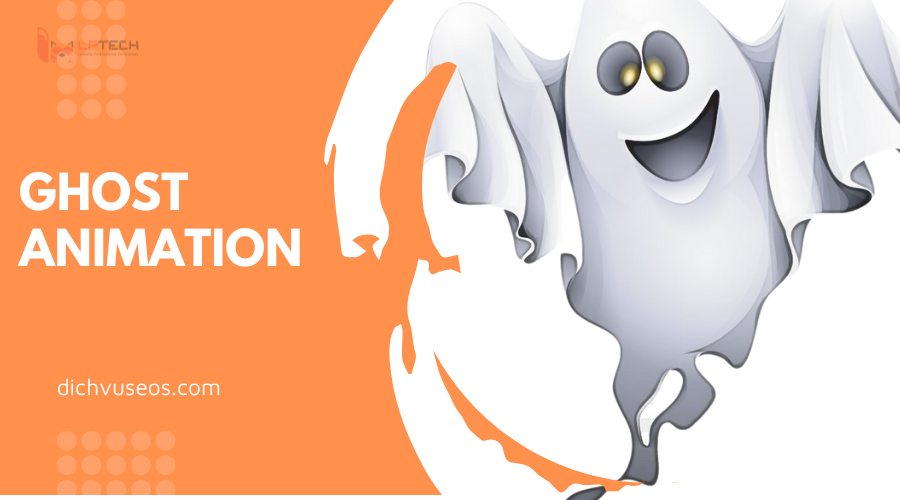
Cũng đã lâu rồi mình không viết bài chia sẻ về HTML, CSS, nên hôm nay mình sẽ làm 1 Ghost animation bằng CSS và HTML để ôn lại kiến thức cũng như chia sẻ kinh nghiệm và hiểu biết của mình về animation với các bạn.
Chuẩn bị
Để tạo một Ghost Animation thì trước tiên bạn hãy tạo cho mình 1 folder, trong đó có chứa 1 file index.HTML và >npx create-react-app project_name cũng được.
Thực hiện
Như các bạn đã thấy trong link kết quả mình để ở trên, chúng ta sẽ tạo ra 1 con ma, và 4 đốm lửa di chuyển liên tục trong 1 không gian cố định. Con ma có 1 mắt và chiếc lưỡi thè ra sẽ đảo liên tục qua lại. Những đốm lửa sẽ bập bùng liên tục.
Để dễ dàng thực hiện, chúng ta sẽ làm từng phần một:
Tạo 1 không gian cố định cho con ma và những đốm lửa di chuyển:
import React from "react";
import ReactDOM from "react-dom";import "./>;
function App() {
return (
<div className="container">
</div>
);
}const rootElement = document.getElementById("root");
ReactDOM.render(<App />, rootElement);
code CSS, chúng ta sẽ dùng linear-gradient để tạo được màu như trong link kết quả:
.container {
width: 800px;
height: 400px;
border: solid;
position: relative;
background-image: linear-gradient(black, white);
}
Tạo con ma dễ thương
Xong phần khung rồi thì chúng ta đến phần ruột nào, tạo tiếp con ma nhé. để tạo được con ma dễ thương như vậy thì ta phải tách biệt 2 phần là đầu và thân, ở phần đầu sẽ thêm vào mắt ( trong mắt thì có thêm con ngươi để nó liếc qua liếc lại nhé). Phần thân sẽ có miệng và cái lưỡi của nó.
<div className="ghostContainer">
<div className="ghostHead">
<div className="ghostEye">
<div className="ghostEye_item" />
</div>
</div>
<div className="ghostBody">
<div className="ghostMouth">
<div className="ghostMouth_licker" />
</div>
</div>
</div>
code CSS:
.ghostContainer {
height: 150px;
width: 100px;
position: absolute;
animation: moveAround 5s infinite;
animation-timing-function: linear;
animation-direction: alternate;
}
.ghostHead {
position: relative;
width: 100%;
height: calc(100% / 3 * 1);
background-color: lightblue;
border: 1px solid;
border-top-left-radius: 999px;
border-top-right-radius: 999px;
border-bottom-color: transparent;
}
.ghostEye {
height: 30px;
width: 30px;
border: 1px solid;
border-radius: 50%;
background-color: white;
position: absolute;
top: 50%;
left: 50%;
transform: translate(-50%);
}
.ghostEye_item {
height: 15px;
width: 15px;
border-radius: 50%;
background-color: black;
position: absolute;
animation: moveEye 10s infinite;
animation-timing-function: linear;
}
.ghostBody {
width: 100%;
height: calc(100% / 3 * 2);
background-color: lightblue;
border: 1px solid;
border-top-color: transparent;
display: flex;
justify-content: center;
align-items: center;
}.ghostMouth {
width: 70%;
height: 40%;
border: 1px solid;
background-color: rgba(0, 0, 0, 0.8);
border-radius: 999px;
position: relative;
display: flex;
justify-content: center;
align-items: center;
}.ghostMouth_licker {
position: absolute;
top: 40%;
width: 50%;
height: 120%;
background-image: linear-gradient(rgba(0, 0, 0, 0.8), red);
border-bottom-left-radius: 50%;
border-bottom-right-radius: 50%;
transform-origin: top center;
animation: licker 3s infinite;
animation-timing-function: linear;
}@keyframes moveAround {
0% {
top: 20%;
left: 0;
}
20% {
top: 30%;
left: 20%;
}
40% {
top: 10%;
left: 40%;
}
60% {
top: 20px;
left: 60%;
}
80% {
top: 35%;
left: 80%;
}
100% {
top: 20%;
left: calc(100% - 100px);
}
}@keyframes moveEye {
0% {
top: 25%;
}10% {
top: 25%;
right: 0;
}
50% {
top: 25%;
right: 0;
}
55% {
top: 25%;
}
100% {
top: 25%;
}
}@keyframes licker {
0% {
transform: rotate(0);
}
30% {
transform: rotate(0);
}
32.5% {
transform: rotate(-15deg);
}
35% {
transform: rotate(15deg);
}
37.5% {
transform: rotate(-15deg);
}
40% {
transform: rotate(15deg);
}
42.5% {
transform: rotate(0);
}
100% {
transform: rotate(0);
}
}
Bạn có thể thay đổi các thông số của animation function để con ma di chuyển theo hướng mình muốn. Việc chia nhỏ keyframes ra cũng giúp xử lý được hoạt động của con ma 1 cách mượt mà hơn.
Tạo những đốm lửa bập bùng nào
Nếu bạn chịu khó quan sát kỹ, thì ngọn lửa ở ngoài đời không chỉ có 1 màu đỏ, mà sẽ bao gồm cả màu trắng, vàng và cam nữa. Nên chúng ta cũng sẽ cố gắng tạo ra 1 ngọn lửa thật nhất có thể
<div className="fireContainer">
<div className="fireItem">
<div className="red flame" />
<div className="orange flame" />
<div className="yellow flame" />
<div className="white flame" />
</div>
</div>
Vì chúng ta sẽ tạo 4 ngọn lửa di chuyển khác nhau nên sẽ đặt thêm class cho nó nhé, ví dụ, ngọn lửa số 1 sẽ là:
<div className="fireContainer fireContainer_1">
CSS code và animation của lửa:
.fireContainer {
position: absolute;
animation: fireMoveAround 10s infinite;
animation-timing-function: linear;
animation-direction: alternate;
}.fireContainer_1 {
animation-delay: 0s;
}
.fireContainer_2 {
animation-delay: 2s;
}
.fireContainer_3 {
animation-delay: 6s;
}
.fireContainer_4 {
animation-delay: 8s;
}.fireItem {
width: 60px;
height: 60px;
position: relative;
transform-origin: center bottom;
animation: fire 3ms infinite;
animation-delay: 200ms;
animation-timing-function: ease-in;
animation-direction: alternate;
}.flame {
bottom: 0;
position: absolute;
border-bottom-right-radius: 50%;
border-bottom-left-radius: 50%;
border-top-left-radius: 50%;
transform: rotate(-45deg);
}.yellow {
left: 15px;
width: 30px;
height: 30px;
background: gold;
box-shadow: 0px 0px 9px 4px gold;
}.orange {
left: 10px;
width: 40px;
height: 40px;
background: orange;
box-shadow: 0px 0px 9px 4px orange;
}.red {
left: 5px;
width: 50px;
height: 50px;
background: OrangeRed;
box-shadow: 0px 0px 5px 4px OrangeRed;
}.white {
left: 15px;
bottom: -4px;
width: 30px;
height: 30px;
background: white;
box-shadow: 0px 0px 9px 4px white;
}
@keyframes fireMoveAround {
0% {
top: 5%;
left: 5%;
}
10% {
top: 40%;
left: 25%;
}
20% {
top: 80%;
left: 15%;
}
30% {
top: 85%;
left: 40%;
}
40% {
top: 60%;
left: 60%;
}
50% {
top: 30%;
left: 30%;
}
60% {
top: 35%;
left: 50%;
}
70% {
top: 50%;
left: 80%;
}
80% {
top: 60%;
left: 50%;
}
90% {
top: 75%;
left: 65%;
}
100% {
top: 85%;
left: 40%;
}
}
@keyframes fire {
0% {
transform: rotate(-1deg);
}
20% {
transform: rotate(1deg);
}
40% {
transform: rotate(-1deg);
}
60% {
transform: rotate(1deg) scaleY(1.04);
}
80% {
transform: rotate(-2deg) scaleY(0.92);
}
100% {
transform: rotate(1deg);
}
}
Bạn có thể thấy rằng, cả 4 ngọn lửa sẽ di chuyển hệt nhau, chỉ khác nhau ở thời gian delay, mình đã chia khá nhỏ từng giai đoạn di chuyển của ngọn lửa, cộng thêm thời gian delay, sẽ làm 4 ngọn lửa xuất phát ở 4 thời điểm khác nhau, làm chúng ta cảm tưởng mỗi ngọn lửa di chuyển khác nhau. Hoặc nếu bạn đủ thời gian và kiên trì, có thể thêm move cho mỗi ngọn lửa
> Xem thêm bài viết:
Website Wordpress - Lỗi bảo mật trong thiết kế web và cách khắc phục
5 bất lợi khi không có website
Chỉ với HTML, CSS mà chúng ta đã có thể tạo ra 1 Ghost animation đầy màu sắc và hấp dẫn. Cảm ơn các bạn đã bỏ thời gian để theo dõi bài viết của mình. Xin chào và hẹn gặp lại các bạn trong những bài viết tiếp theo


